

The Ultimate Guide to CSS Flexbox Properties
Part 2: Flexbox Properties

Hello, I'm Lanie, short for Melanie. I'm passionate about writing, web design, and web development. I write about web design and development related topics. I'm also pursuing a career in frontend web Dev, I hope to impact the world one way or another but mostly with my creativity.
Introduction
In the previous article, we covered the basic terminologies of Flexbox. We shall use those terms to understand flexbox properties.
This is part 2 of the CSS Flexbox 3-part series, it is the ultimate guide to Flexbox. It covers in-depth explanations of each property. By the end of this article, you should know all about:
Flexbox alignment properties (align-items, align-content, and more)
Orientation properties ( order)
Flex container-specific properties
Flex items' specific properties
Flexbox Properties
Flexbox is made up of 12 properties including 2 shorthand properties, as well as the display: flex | Inline-flex; These properties are classified into two:
Application to Flex container (Parent Container)
Application to Flex items ( Child elements)
Properties Applied to Flex Container
Display
.container {
display:flex | inline-flex;
}
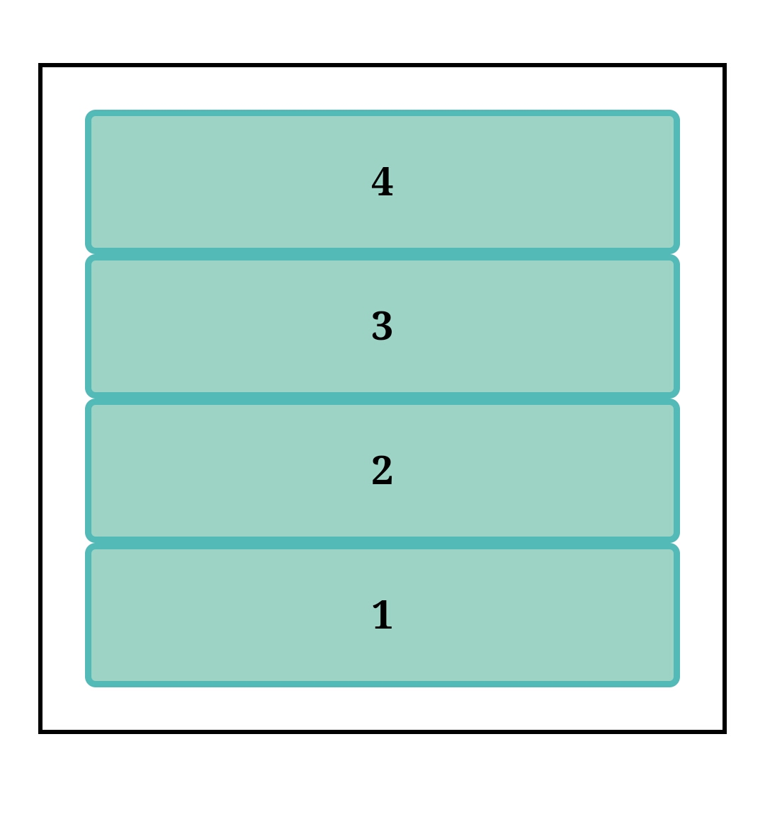
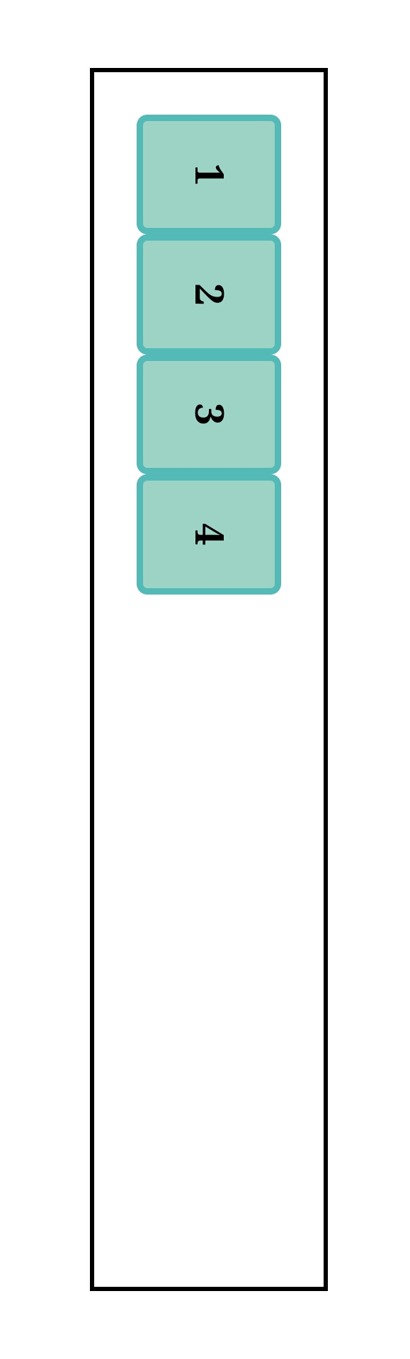
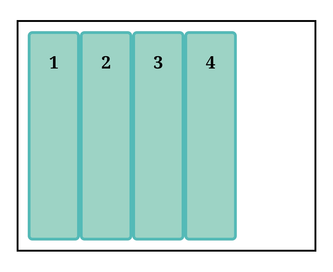
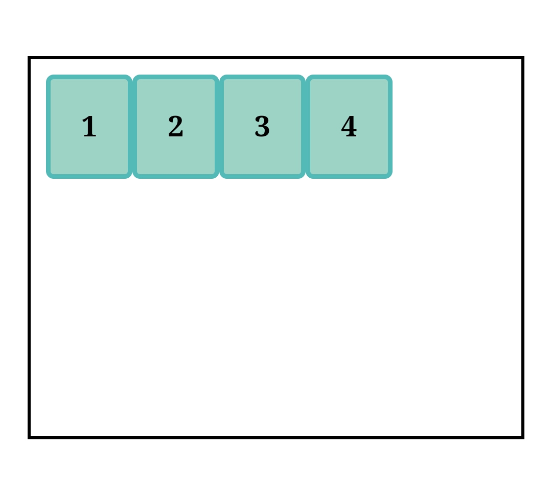
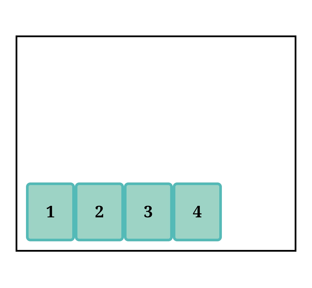
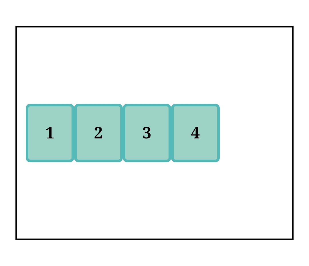
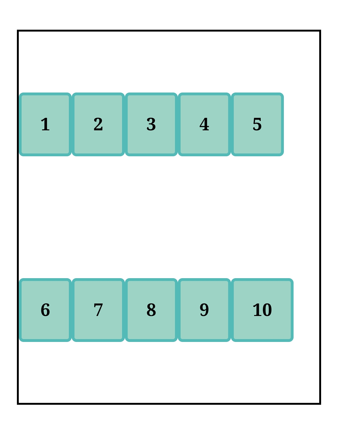
This property defines an element as a flex container either at block level (display: flex;) or at Inline level (display:inline-flex) when placed in flow layout. This means that the direct children will become flex items and can be subjected to all the perks Flexbox has to offer.
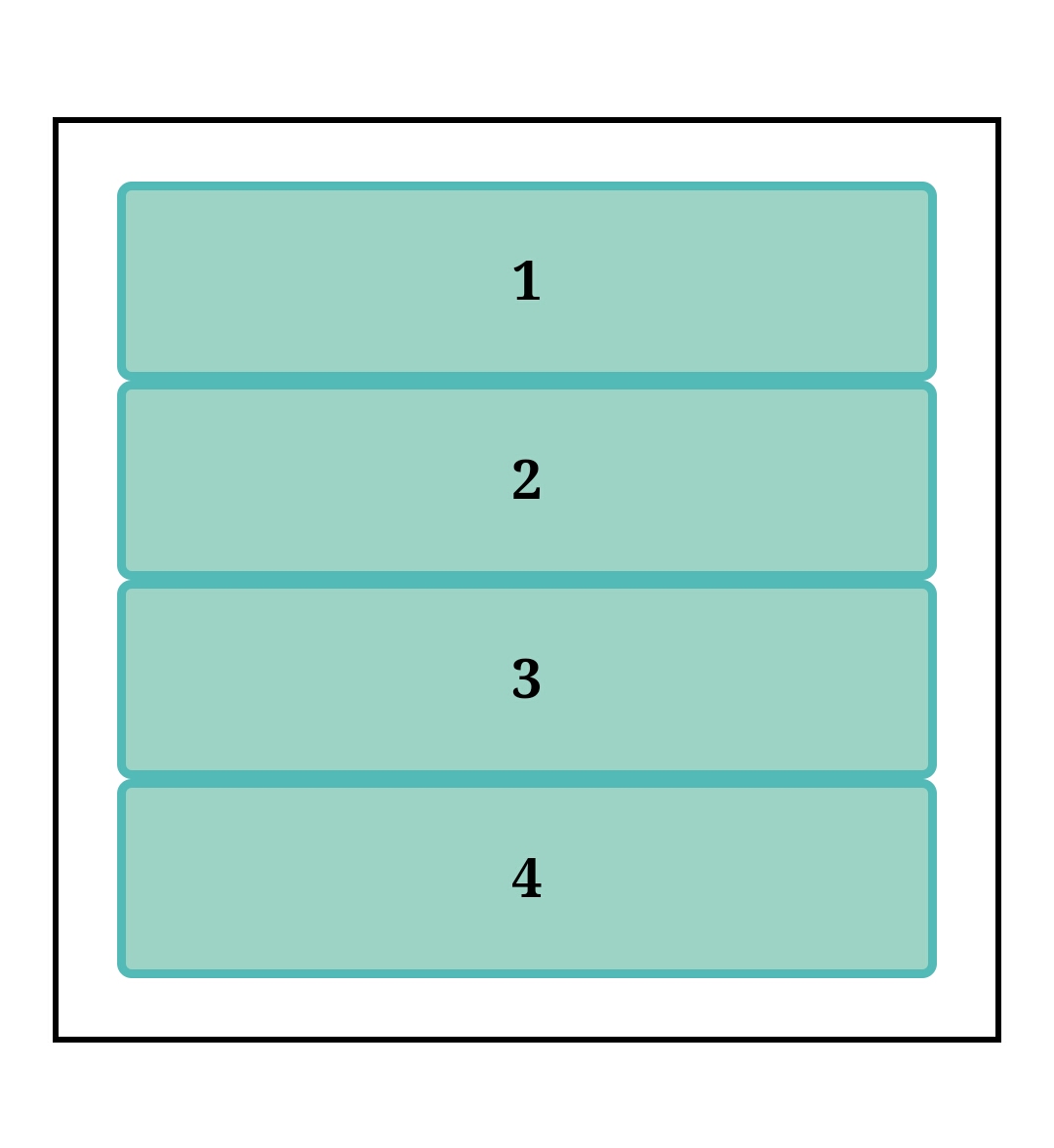
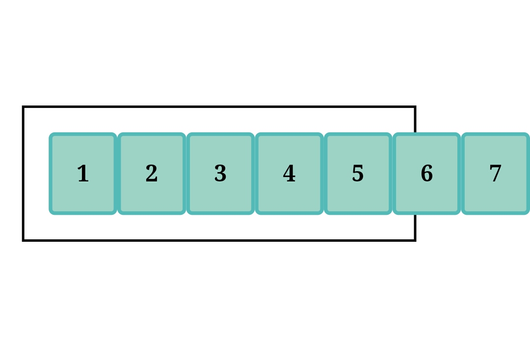
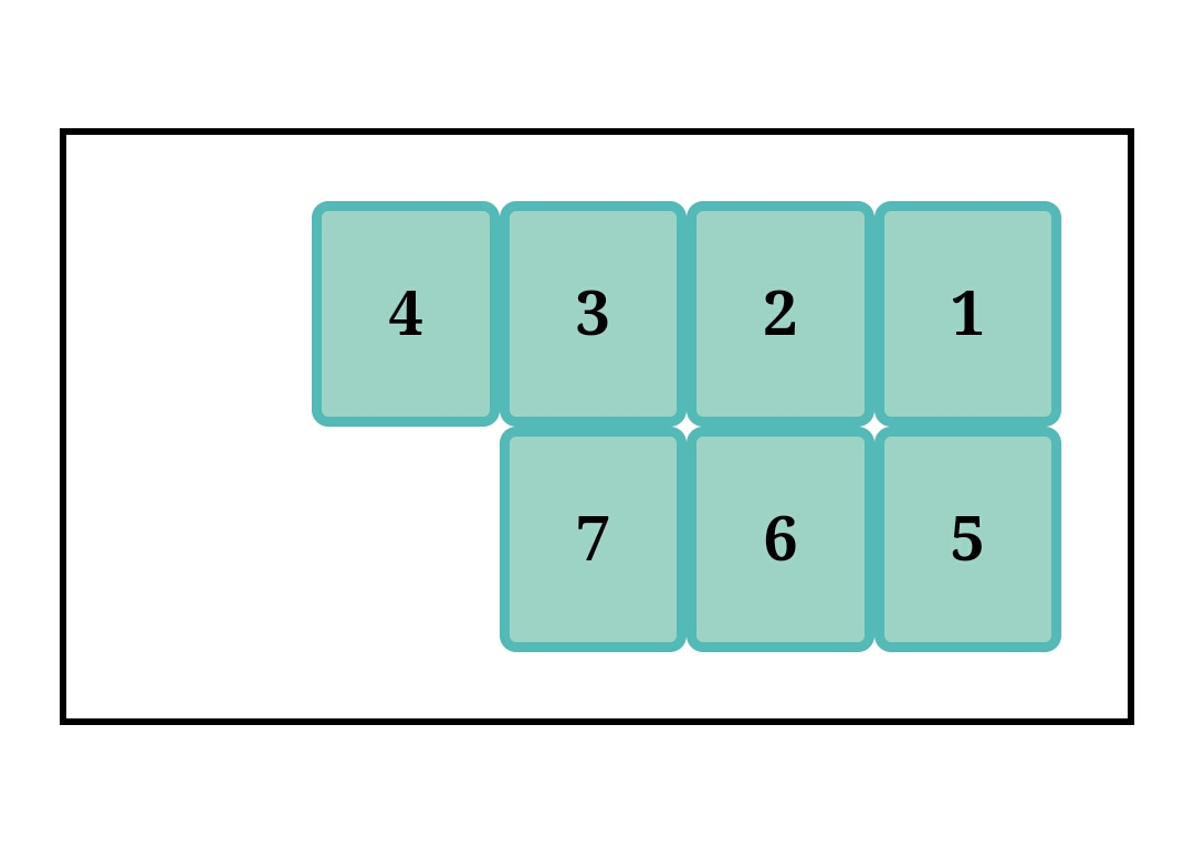
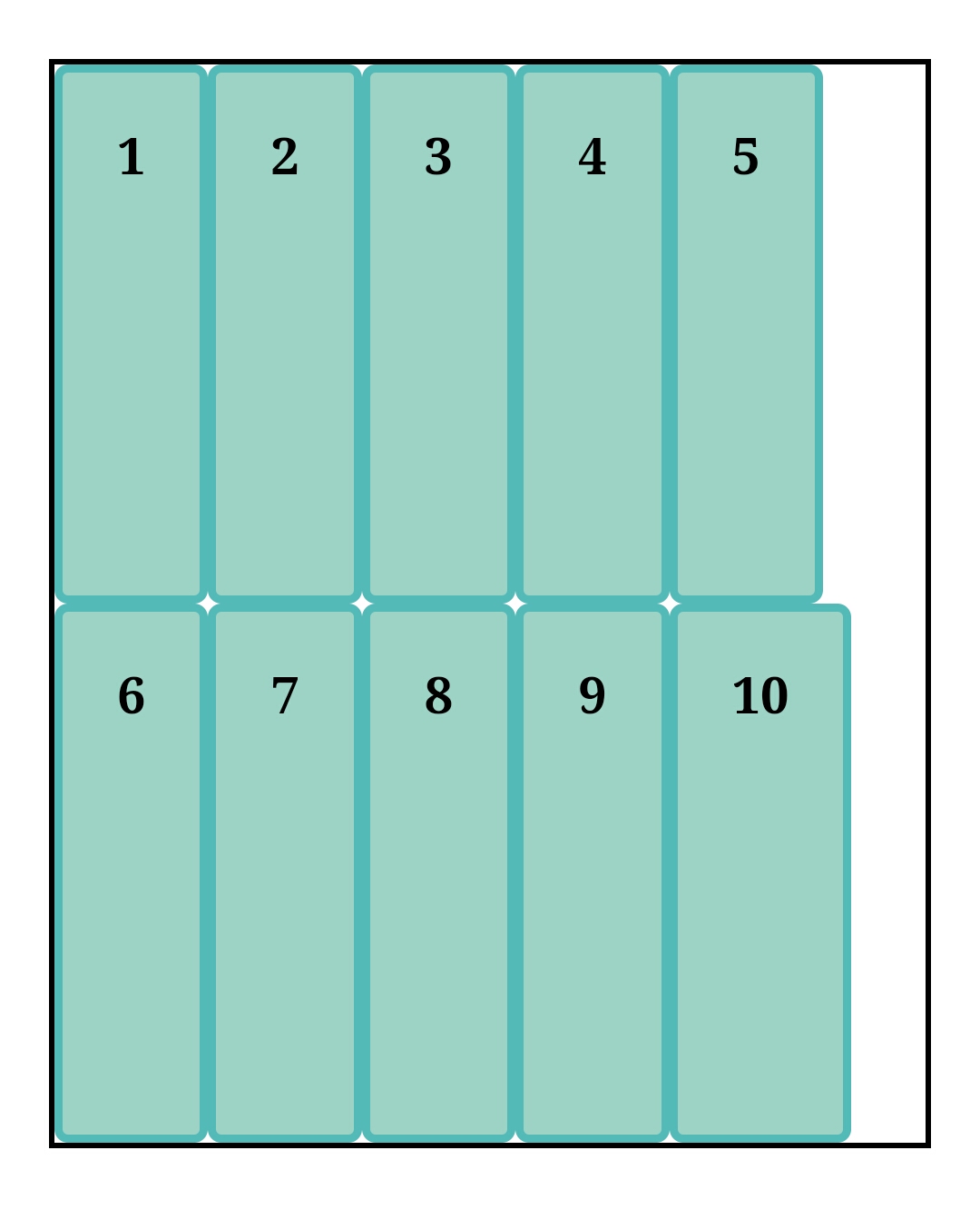
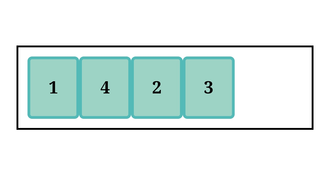
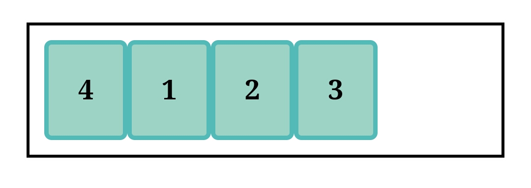
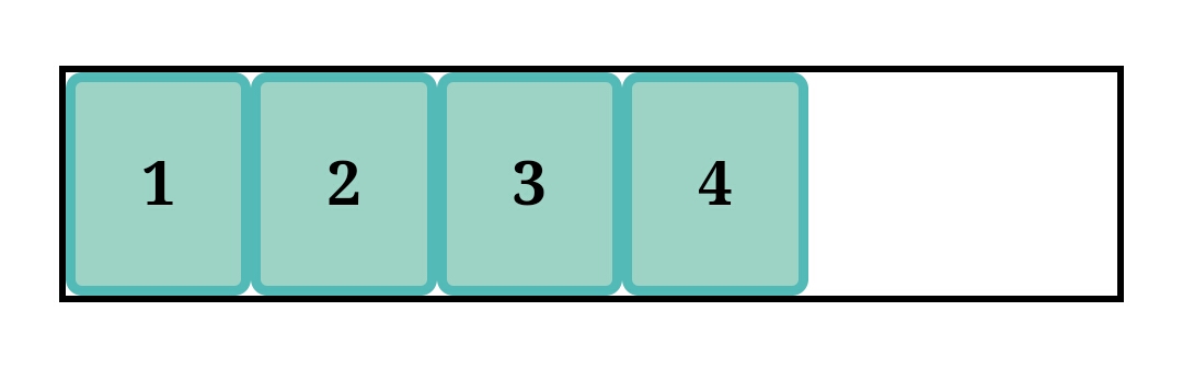
Above is a container with four direct children. They are block level elements, and as observed each element begins on a new line. When display is set to flex :
.container{
display:flex;
}
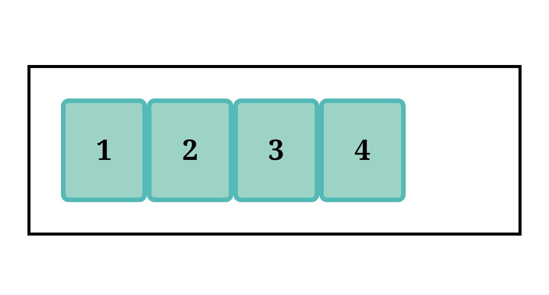
As you can see the flex items are now arranged in rows.
Flex-direction
.container {
display: flex;
flex-direction: row | column | row-reverse | column;
default value: row
This property specifies how flex items are laid out, it also determines the main axis. Note that writing mode also affects how flex direction is used and where the main axis lies.
Another important fact to keep in mind is that the reverse properties are purely for visual ordering i.e. screen layout and navigation rely on the source code layout.
If a flex container is set to row reverse a screen reader would still read the flex content in the order it's arranged on the source code.
row
As stated earlier this is the default value, items are arranged from left to right. The main axis runs from left to right while the cross axis runs from top to bottom.
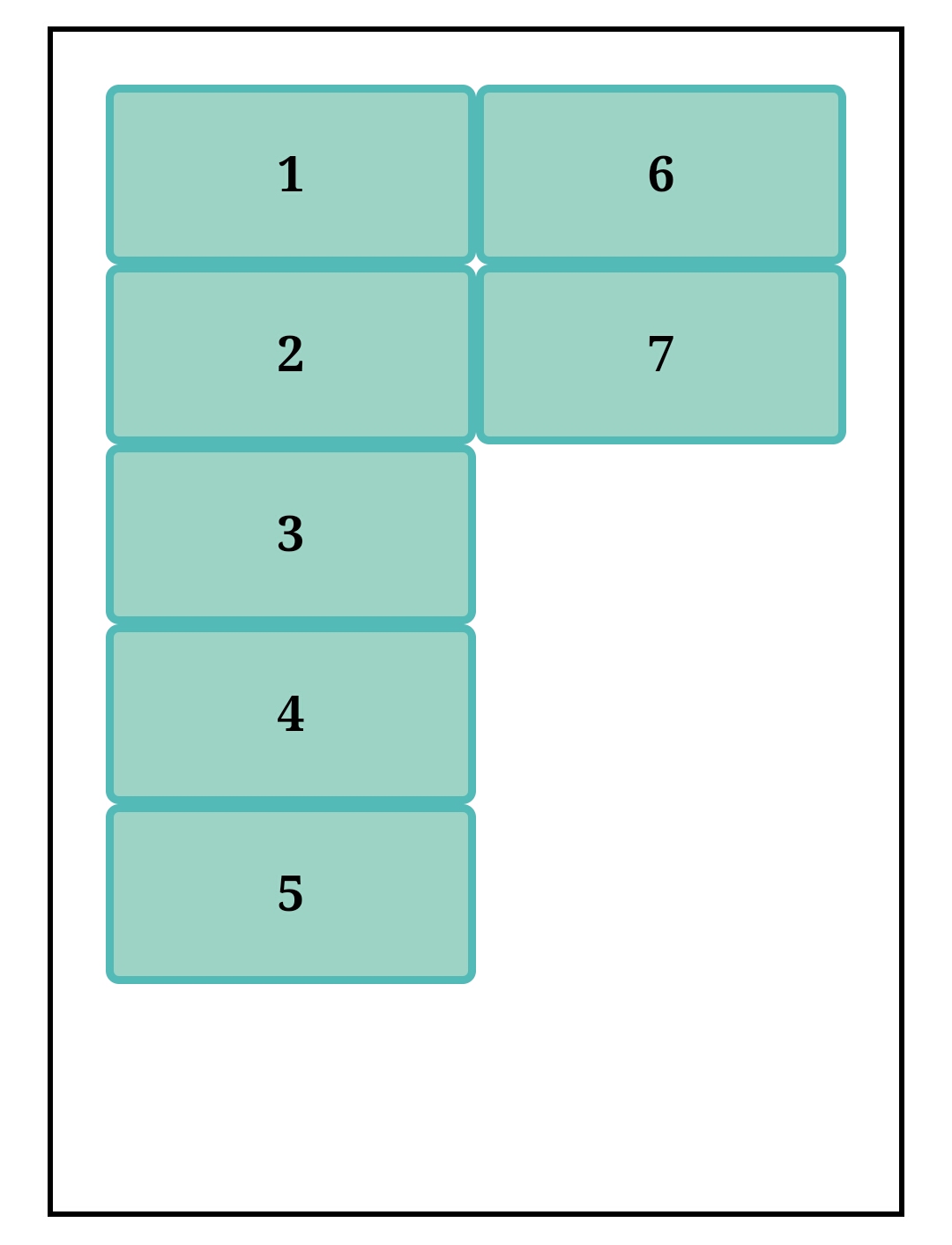
column
Flex items are stacked from top to bottom and they try to take up all available space. The main axis runs from top to bottom as well, while the cross axis - being perpendicular to the main axis, will run from right to left.
row-reverse
As observed this is the opposite of row, the items are laid out from right to left.
The main axis runs from right to left, while the cross goes from top to bottom.
column-reverse
Opposite to flex-direction: column; the items are stacked from bottom to top. The main axis runs from bottom to top while the cross axis, right to left.
Flex-wrap
.container{
display: flex;
flex-wrap: nowrap | wrap | wrap-reverse;
}
default value:nowrap
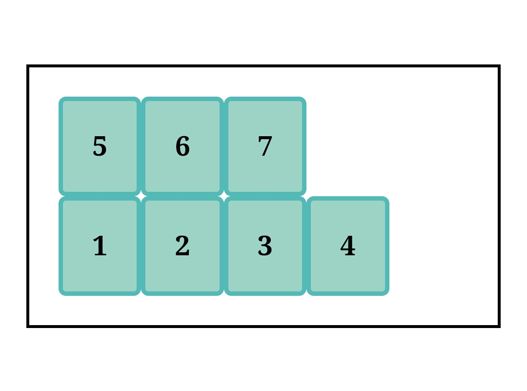
Ordinarily, flex items want to remain on one line no matter how many they are. If they can shrink, they try to fit into one line in the container, if they can't they overflow but remain on one line still. In most cases, this doesn't look good.
Flex wrap is responsible for making items wrap onto another line if they can't fit in one. It also determines the cross-axis direction.
nowrap
This is the default value and flex items overflow the container while staying on one line.
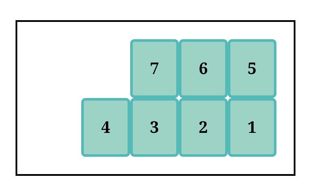
wrap

flex items adjust to fit into the container by moving to the next line.
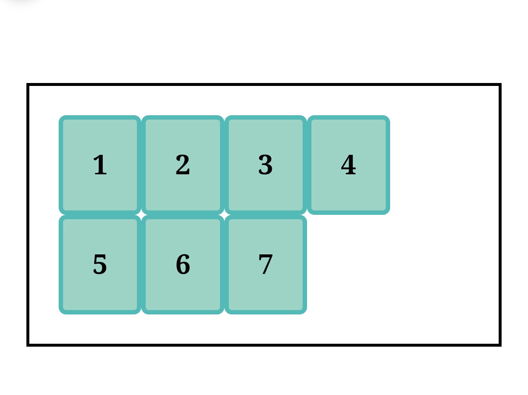
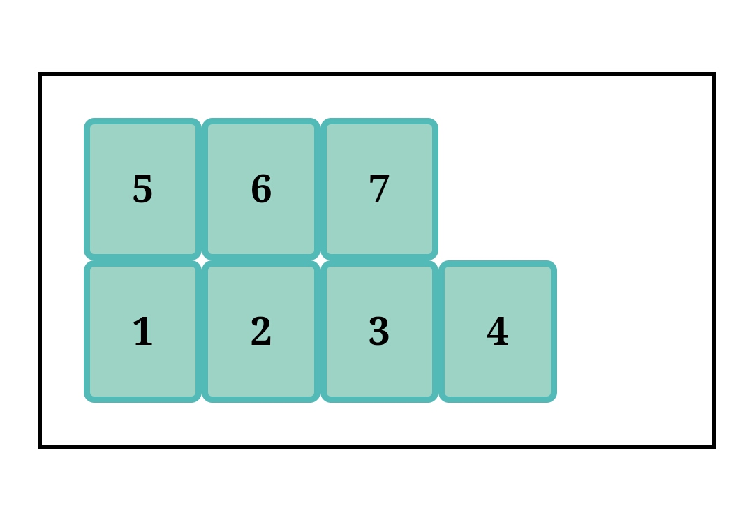
wrap-reverse
This is similar but opposite to wrap, while wrap stacks from top to bottom, wrap-reverse stacks from bottom to top.
Flex-flow
.container{
display: flex;
flex-flow: (flex-direction) (flex-wrap);
}
default: row nowrap;
It is the shorthand for flex-direction and flex-wrap in that order. It defines the main axis and cross axis of the container. It has 12 possible combinations and out of them, 8 combinations mirror one another. Here they are:
- [row wrap] and [row-reverse wrap]
 .container{
display: flex;
flex-flow: row wrap;
}
 .container{
display: flex;
flex-flow:row-reverse wrap;
}
- [row-reverse wrap-reverse] and [row wrap-reverse]
 .container{
display: flex;
flex-flow:row-reverse wrap-reverse;
}
 .container{
display: flex;
flex-flow:row wrap-reverse;
}
- [column wrap] and [column wrap-reverse]
 .container{
display: flex;
flex-flow:column wrap;
}
 .container{
display: flex;
flex-flow:column wrap-reverse;
}
- [column-reverse wrap] and [column-reverse wrap-reverse]
 .container{
display: flex;
flex-flow:column-reverse wrap;
}
 .container{
display: flex;
flex-flow:column-reverse wrap-reverse;
}
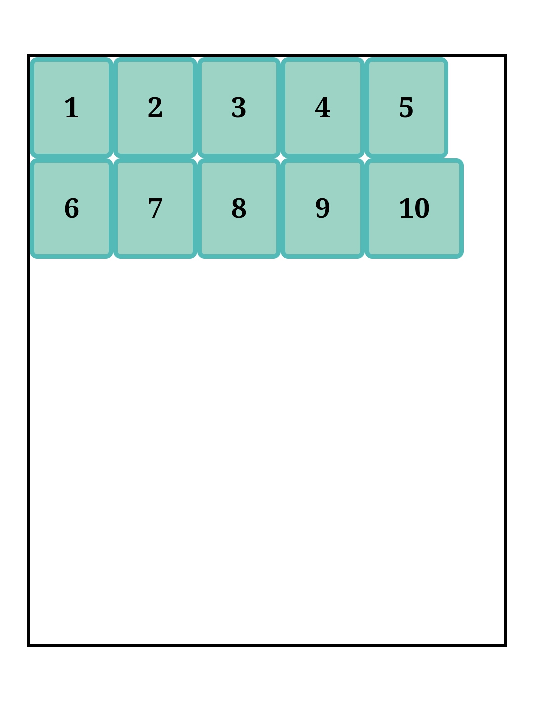
Justify-content
.container{
display:flex;
justify-content: flex-start | flex-end | center | space-between | space-around | space-evenly;
}
default value: flex-start
It aligns flex items along the main axis set and distributes extra space about each item.
It has 6 values, 3 for positioning and 3 for space distribution.
Positioning values:
flex-start
.container{
display:flex;
justify-content: flex-start;
}
Items are stacked at the main start of the flex container's main axis.
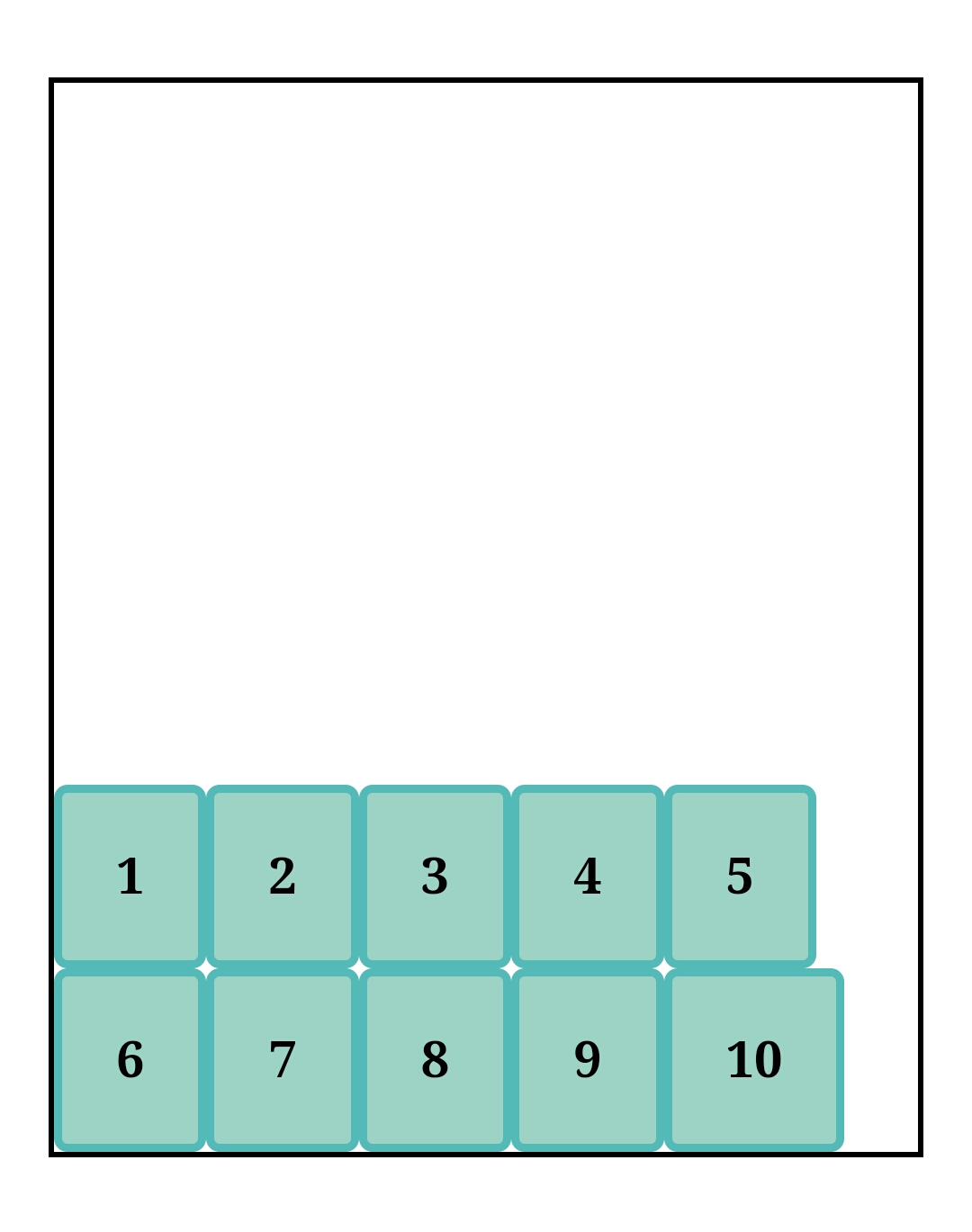
flex-end
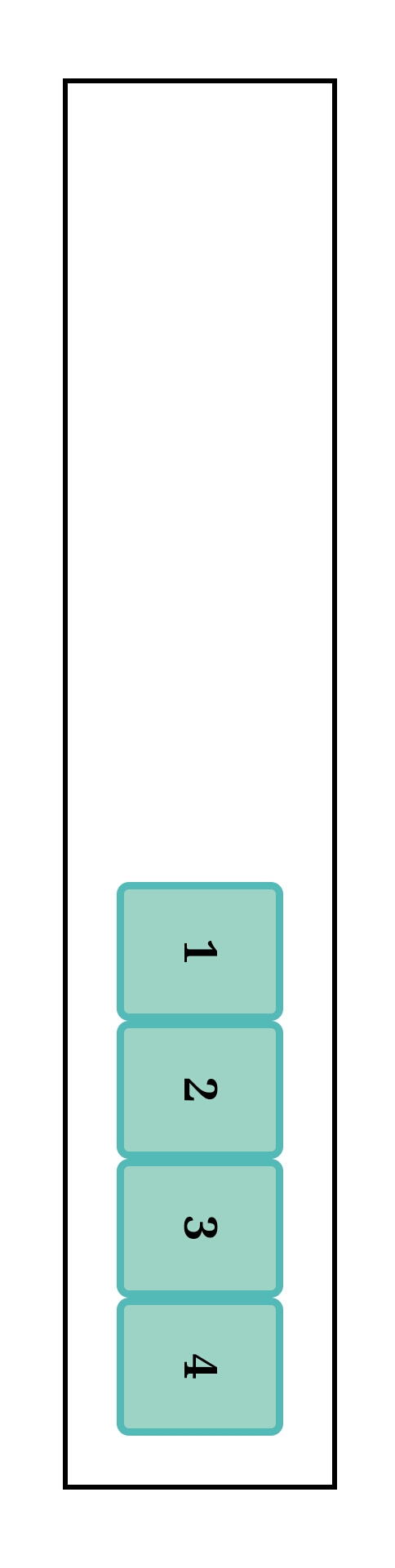
.container{
display:flex;
justify-content: flex-end;
}
Items are stacked at the main end of the flex container's main axis.
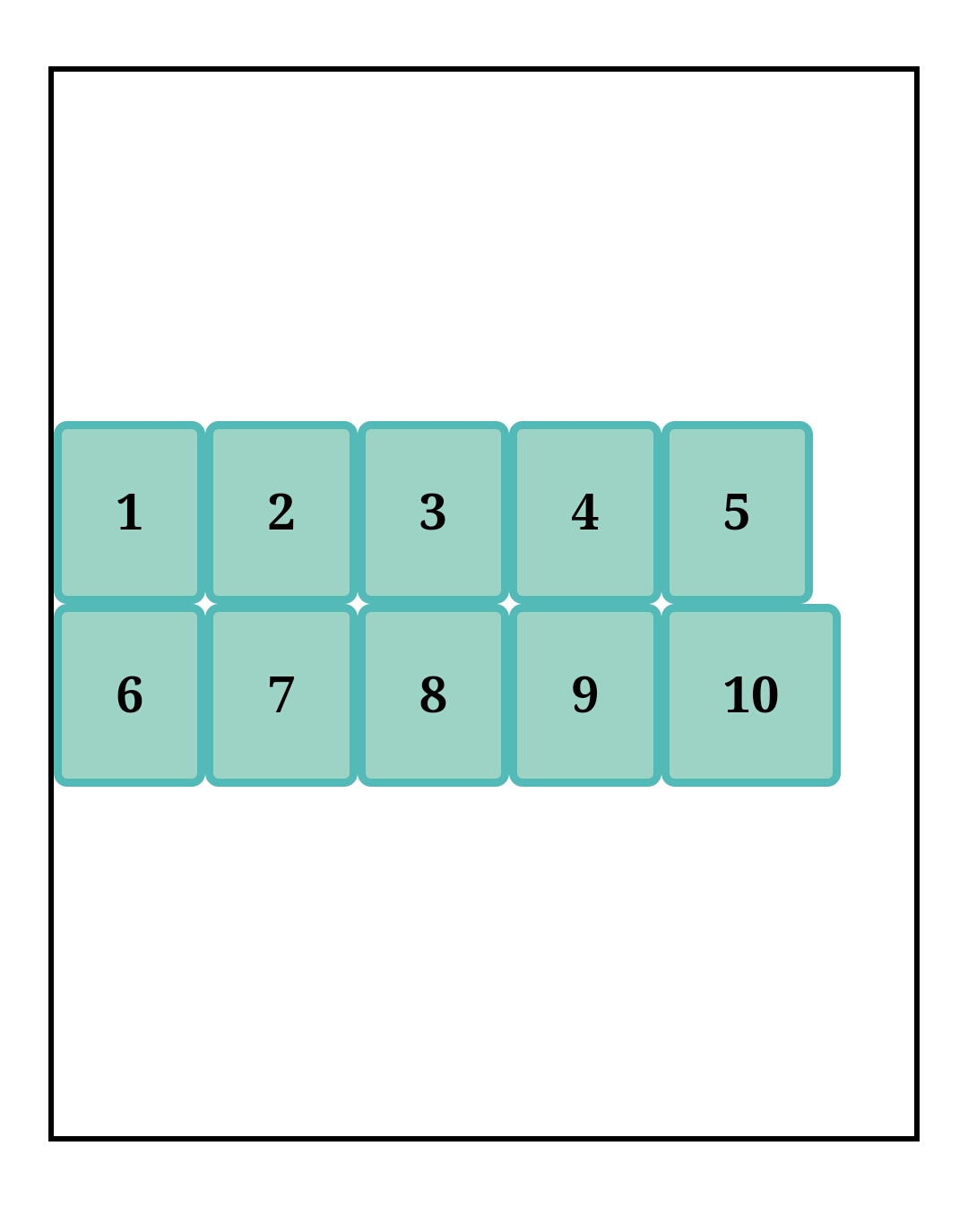
center
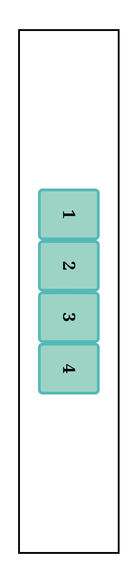
.container{
display:flex;
justify-content: center;
}
Items are stacked at the center of the flex container's main axis.
Space distribution values:
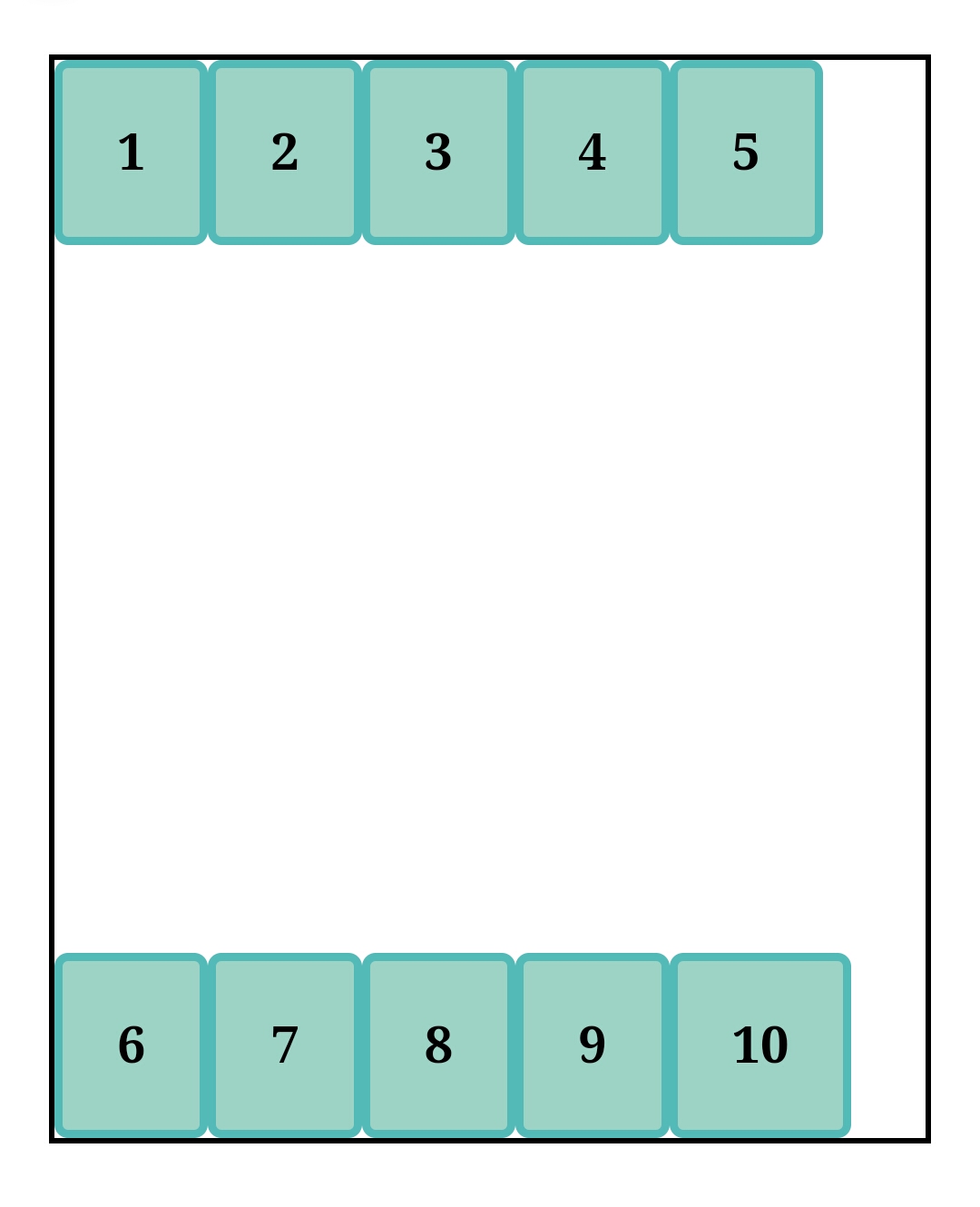
space-between
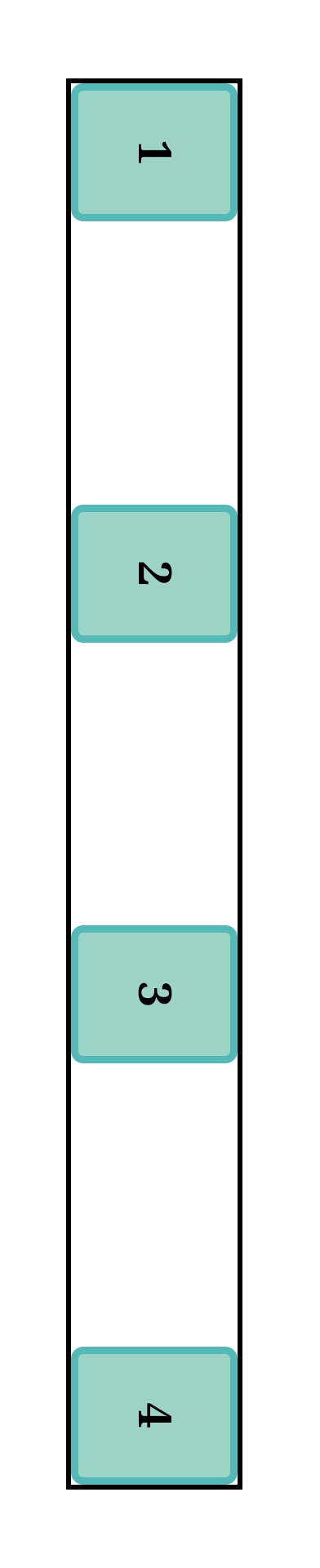
.container{
display:flex;
justify-content: space-between;
}
Items are aligned with equal spacing between them, with the first item stacked at the main start and the last item stacked at the main end.
space-around
.container{
display:flex;
justify-content: space-between;
}
Items are aligned with equal spacing around them, i.e. each item has half spacing on both sides of it. From the main start, there's half space to the first item and from the main end, there's half space to the last item.
Breaking it down, item 1 has half space on the LHS and half space on the RHS. item 2 has half space on the LHS and half space on the RHS, making the space between items 1 and 2 equal to one. The same goes for items 3 to 4.
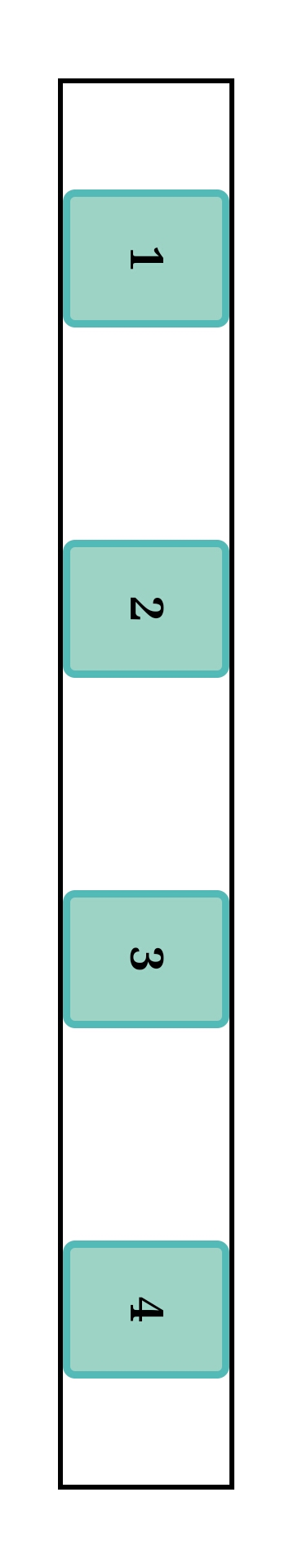
space-evenly
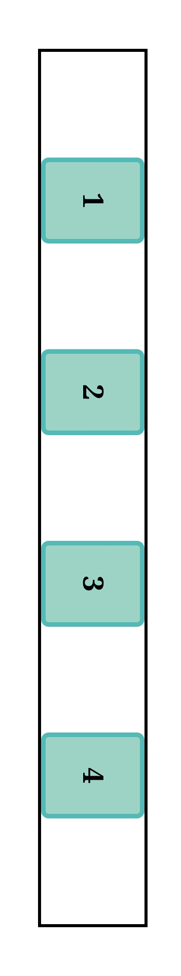
.container{
display:flex;
justify-content: space-evenly;
}
Items are aligned with equal spacing between them, including between the main start and the first item and, between the main end and the last item.
Therefore, the space between the main start and the first item is equal to the space between the first and second item; second and third item; and so on till the last item and main end.
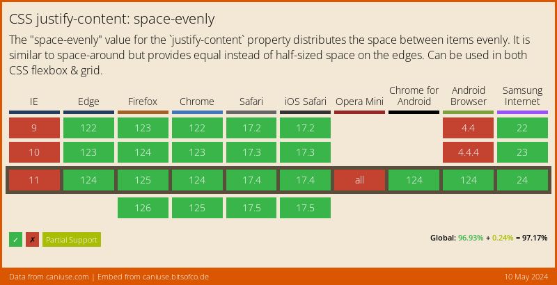
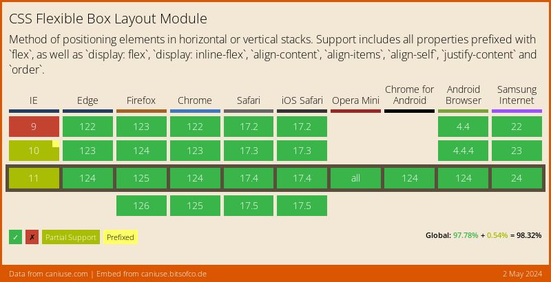
Below is the browser compatibility chart for space-evenly from caniuse.com
Align-items
.container{
display:flex;
align-items: flex-start | flex-end | center | baseline | stretch;
}
default value: stretch
This aligns flex items on the cross axis set.
- stretch
.container{
display:flex;
align-items: stretch;
}
Items stretch throughout the height of the container on the cross axis.
- flex-start
.container{
display:flex;
align-items:flex-start;
}
Items align at the cross start on the cross axis.
- flex-end
.container{
display:flex;
align-items: flex-end;
}
Items align at the cross end on the cross axis.
- center
.container{
display:flex;
align-items:center;
}
Items align at the center of the cross axis.
- baseline
The baseline is the invisible line upon which letters rest. from fonts.google.com
From the above, the baseline for typography is explained. The blue and red line under the text is the baseline.
.container{
display:flex;
align-items:baseline;
}
Items align relative to baseline. I've given the item contents different font sizes for clear observation. They all line up to the baseline regardless of size.
From the above, when the content is longer, you might wonder how items align to the baseline. The items align relative to the first line of the text's baseline. Therefore this is a better definition.
Align-content
.container{
display:flex;
align-content: flex-start | flex-end | center | space-between | space-around | stretch;
}
default value:stretch
This property is like a hybrid of align-items and justify-content. It aligns multi-line items (from flex-wrap: wrap | wrap-reverse;) on the cross axis. It also distributes extra space on the cross axis to the lines.
- flex-start
.container{
display:flex;
align-content:flex-start;
}
Multi-line items align at the cross start of the cross axis.
- flex-end
.container{
display:flex;
align-content:flex-end;
}
Multi-line items align at the cross end of the cross axis
- center
.container{
display:flex;
align-content: center;
}
Multi-line items align at the center of the cross axis.
- space-between
.container{
display:flex;
align-content:space-between;
}
It distributes space between multi-lines. Check justify-content for the method of distribution.
- space-around
.container{
display:flex;
align-content: space-around;
}
It distributes space around multi-lines. Check justify-content for method of distribution.
- stretch
.container{
display:flex;
align-content: stretch;
}
Multi-line stretch throughout the container.
Properties Applied to Flex Items
Align-self
.container{
display:flex;
align-items: flex-start | flex-end | center | baseline | stretch;
}
.item-n{
align-self: auto | flex-start | flex-end | center | baseline | stretch;
}
default value: auto
This property, when applied to an individual, overrides the align-items value set for the container. This affects only the selected item. It shares the same values with align-items plus one, auto, this is the default value. Items will follow the value pre-assigned by align-items.
Note that like the align-items, align-self lays out item in the cross axis. Below is an example, my flex container is set to align-items:flex-start;:
flex-end
.container{
display:flex;
align-items:flex-start;
}
.item-2{
align-self:flex-end;
}
The item selected is stacked to the cross end on the cross axis.
center
.container{
display:flex;
align-items:flex-start;
}
.item-2{
align-self:center;
}
The selected item is aligned at the center of the cross axis.
see align-items for other values
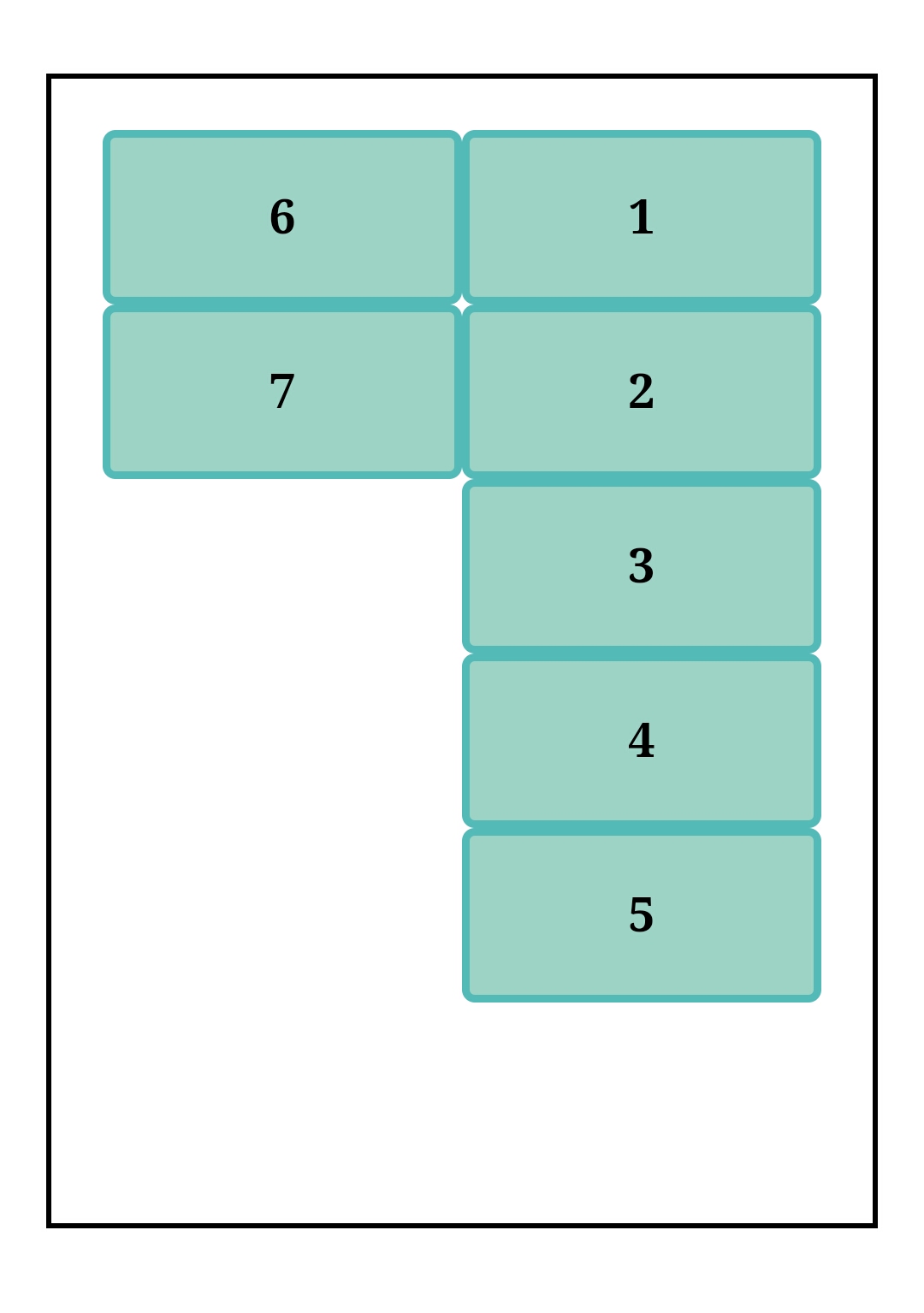
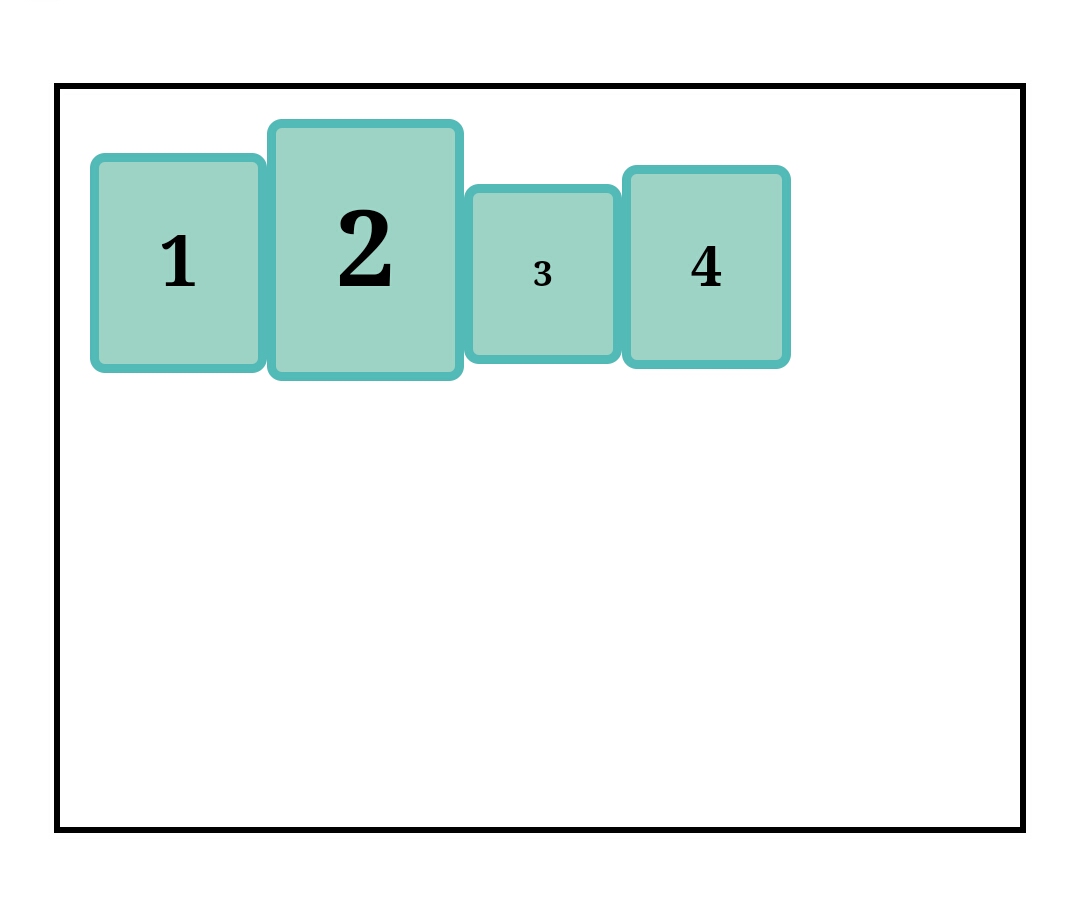
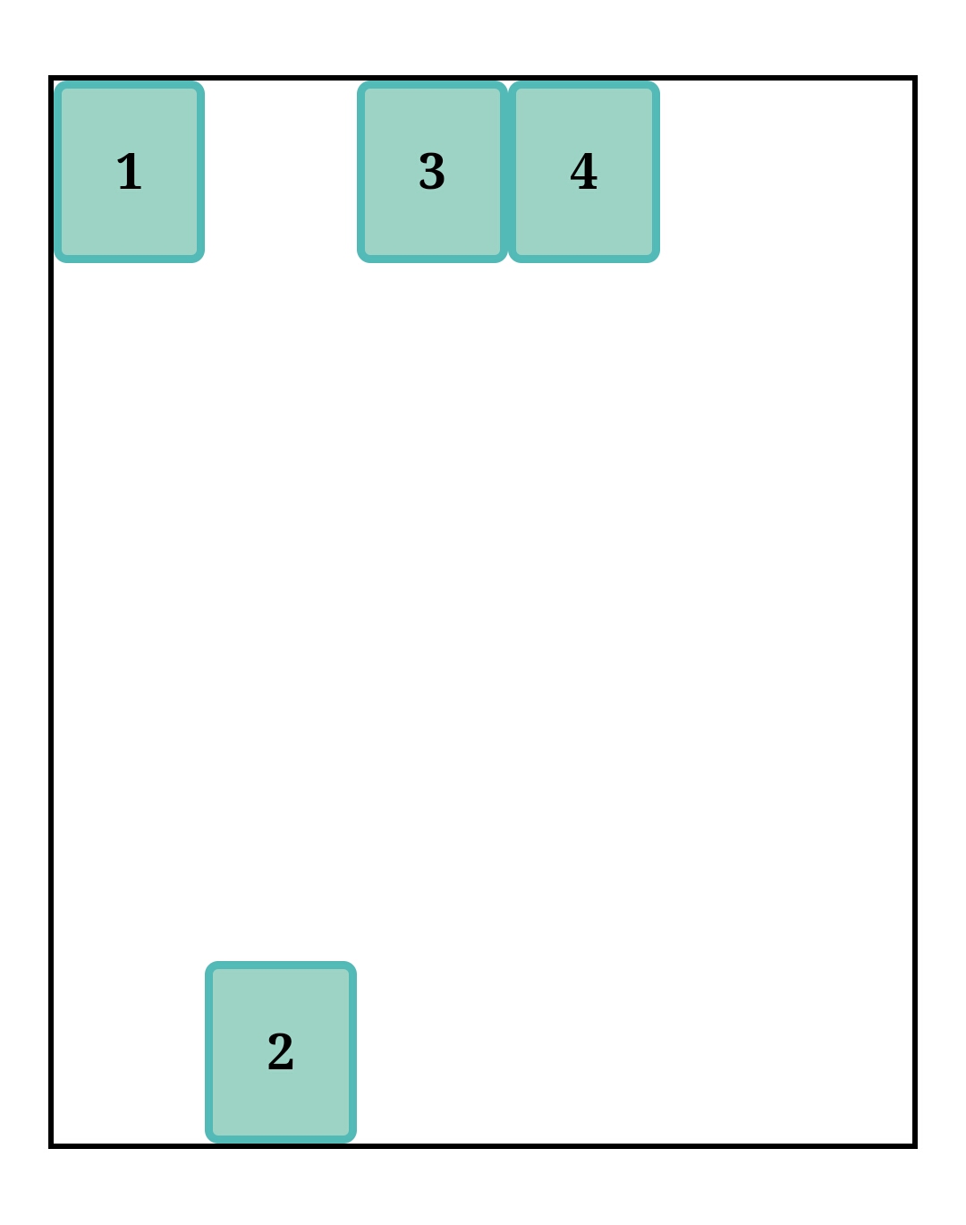
Order
.container{
display:flex;
}
.item-n{
order:<integer>;
}
default value:0
An integer (pronounced IN-tuh-jer) is a whole number (not a fractional number) that can be positive, negative, or zero.
from techtarget.com
Normally items follow the source code layout for items, although this can be overruled with the order property. The value is an integer, and as stated above it could be zero, positive or negative.
How it works:
All items have a default order of 0, this means in ranking they are at the same tier, therefore, they automatically follow the HTML layout. When an item order has a value higher than 0, in ranking it will come after other items, like so:
.container{
display:flex;
}
.item-2{
order:1;
}
.item-3{
order:2;
}
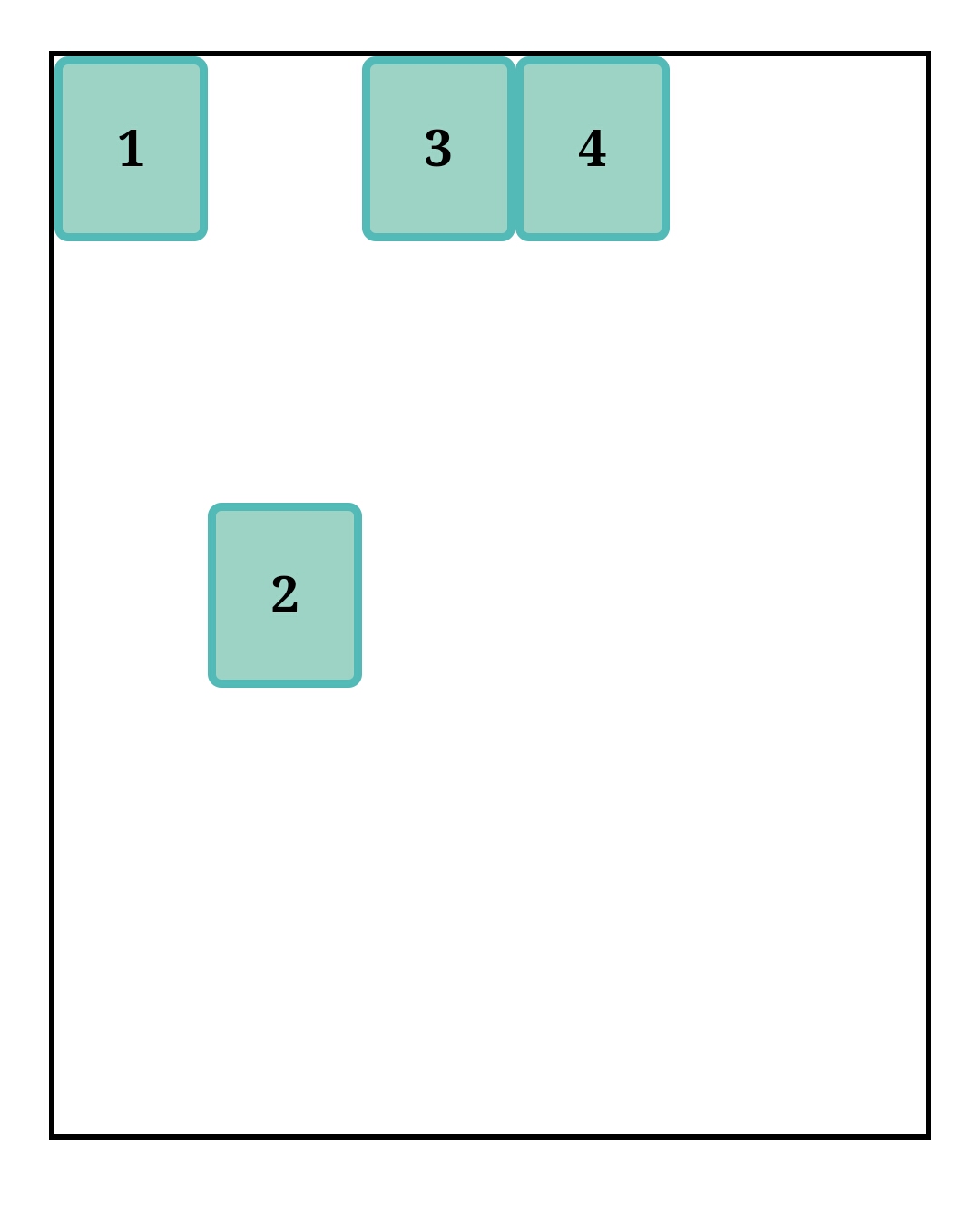
Items 1 and 4 don't have a defined order so they revert to default 0 and automatically follow the source code layout. Item 2 has an order value of 1 therefore, it'll come after items with lower order value. Item 3 has an order value of 2 therefore, it'll come after items with lower order value.
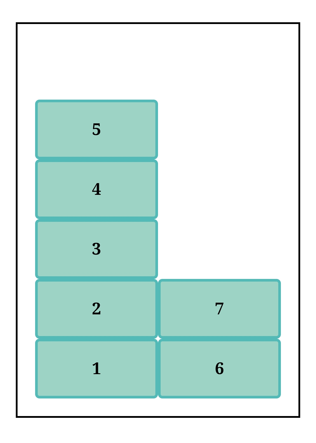
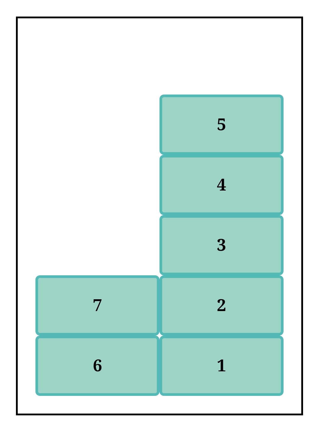
.container{
display:flex;
}
.item-2{
order:1;
}
.item-3{
order:2;
}
.item-4{
  order:-1;
}
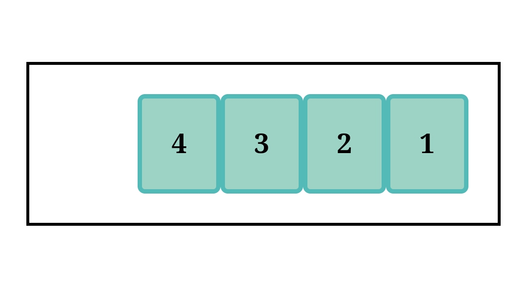
Now item 4 comes first, that because the order is set to -1 which is less than 0. Items now stack according to ranking, from lowest to highest.
flex-grow
.container{
display:flex;
}
.item{
/*negative numbers are invalid*/
flex-grow:<number>;
}
default value:0
The flex-grow property is used to control flex item growth when extra space is distributed about the items. It also controls the rate at which the item should grow. The default value is zero meaning no item will grow even if the viewport size increases.
.container{
display:flex;
}
.item-1{
flex-grow:1;
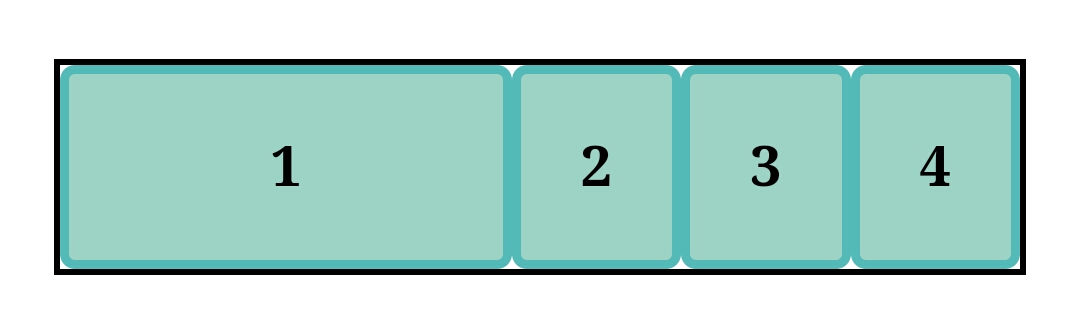
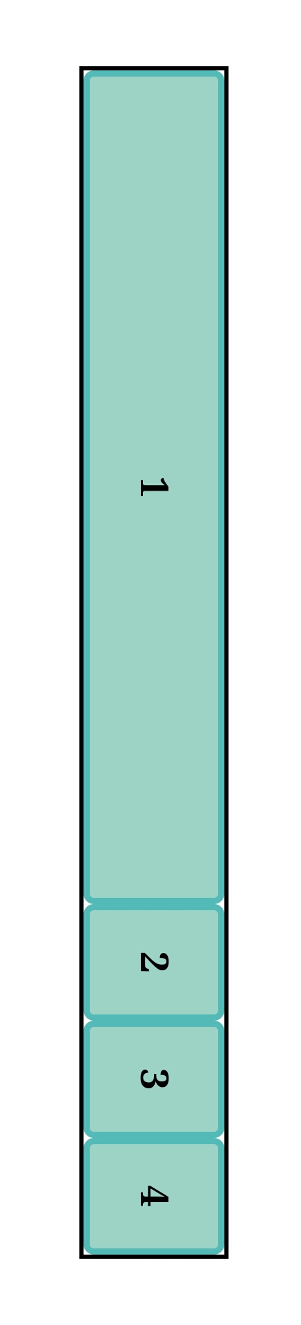
As observed the extra space would be attached to item 1. What happens when all items are set to flex-grow:1;?:
If you guessed that the extra space would be distributed among the items equally? then you're right👍.
I'll demonstrate how flex-grow controls growth:
If screen size is adjusted you'll notice item 1 grows faster than item 3, this is because item 1 has a greater flex-grow value compared to item 3. The extra space is distributed in such a way that item 1 grows two times as fast as item 3.
Flex-shrink and Flex-basis
flex-shrink
default value:1
.container{
display:flex;
}
.item{
/*negative numbers are invalid*/
flex-shrink:<number>;
}
flex-basis
default value: auto
.container{
display:flex;
}
.item{
flex-basis:content | <width>;
}
Flex-shrink controls the shrink factor of flex items, it is observable when paired with the flex-basis property.
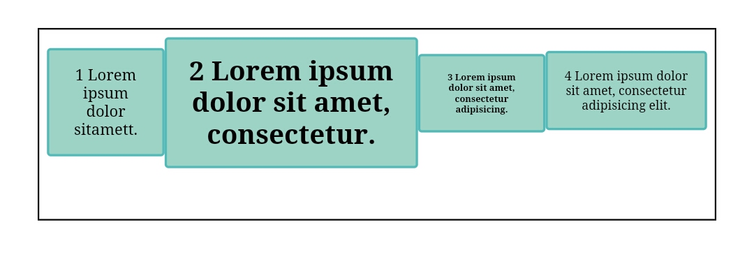
Flex-basis determines the width of flex items before any extra space is distributed about them. It can take units of %, pixel, rem, em etc. but units like vw cannot be used. I would use 3 cases to illustrate how both affect each other:
Case 1(
flex-shrink:0;) %[https://codepen.io/lanieee/pen/XWEQaaL]The flex item is set to a specified width
The item is set to
flex-shrink:1;(item will not shrink)If the item width can't fit into the container when the viewport is smaller it'll overflow
Case 2(
flex-shrink:1;)
The flex item is set to a specified width
The item is set to
flex-shrink:1;(item will shrink)when the viewport is smaller and the item width will not fit into the container, the item will shrink
when the viewport is larger, the item will retain the flex-basis value
Case 3: comparing flex-shrink values
The item with a larger flex-basis value will shrink faster than the other item.
Flex
.container{
display:flex;
}
.item{
flex: flex-grow | flex-shrink | flex-basis;
}
default value:0 1 auto
Flex is a shorthand property for flex-grow, flex-shrink, and flex-basis in that order. It's best to use the flex property as opposed to the individual properties. It is also responsible for the flexibility attributed to Flexbox.
You can set the values to suit your goal or you can use the global values available:
flex: initial;which is the same asflex: 0 1 auto;(the default value) %[https://codepen.io/lanieee/pen/XWEQEwx]flex: auto;which is the same asflex: 1 1 auto;(for complete flexibility)
flex: none;which is the same asflex: 0 0 auto;(zero flexibility) %[https://codepen.io/lanieee/pen/abYxPEo]flex: <positive number>;which is the same asflex: <positive number> 1 0;(flexibility) %[https://codepen.io/lanieee/pen/zYWXyRg]
To learn more about these values check the 2018 W3C candidate recommendation on CSS Flexbox.
Browser Compatibility
For more information check caniuse.com
Conclusion
We've covered all there is to flexbox properties, which will make positioning items and space distribution easier. From display: flex; to flex: auto;, you've learned how to align items on the main and cross axis, you've also learned how to make flexible items and loads more.
Be consistent and you'd soon be well on your way to becoming a Flexbox pro. Want to practice what you've learned in a fun environment check flexbox froggy.
I hope you've had as much fun reading and learning, as I did putting this tutorial together. In the next and final part of this series, we'll practice using the properties.
if you find this article useful do well to share it😌. Suggestions and feedbacks are welcome, share them in the comment section


