

CSS Flexbox
Part 1: Introduction

Hello, I'm Lanie, short for Melanie. I'm passionate about writing, web design, and web development. I write about web design and development related topics. I'm also pursuing a career in frontend web Dev, I hope to impact the world one way or another but mostly with my creativity.
Is Flexbox complicated? Many would say it is but, it is actually really easy to implement. This is part 1 of a 3-part series on CSS flexbox. By the end of this article you should know;
Flexbox definition
A brief timeline on Flexbox
When to use Flexbox
All about the Flexbox box model
CSS is beautiful but can get frustrating at times, especially with positioning elements. When Flexbox was introduced it became the holy grail for elements layout and also a bonus, responsiveness.
Let's dive into it then.
What is Flexbox?
Flexible box module, generally referred to as Flexbox, is a CSS3 layout model. A CSS layout model is a method of positioning elements in a webpage relative to:
Their default position in normal layout flow
Their parent container
Other elements around them
Device viewport
Flexbox is used to layout contents in one dimension i.e. either row or column.
A brief Timeline of CSS Flexbox
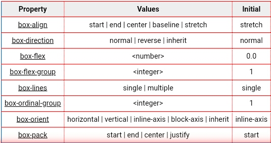
Flexbox underwent a series of changes, starting with 9 properties and now totaling 12 properties.
Read more
Working Draft (23 July 2009 - 12 June 2012)
July 23, 2009
The first working draft published on the World wide web consortium (W3C) was on July 23, 2009.
In its early stages, Flexbox had display: box; . With a total of eight properties, each having the prefix box. The term "box elements" referred to the container while "children of box elements" referred to its content.
March 22, 2011
There were improvements including,
display: flexbox | inline-flexbox;- four properties, each with a prefix flex
- Introduction to properties, flex-direction and flex-order.
- flex-order having an initial value of 1
- Container now renamed flex box and its content, flexbox items.
November 29, 2011
There were modifications and further improvements including,
- Introduction of the Flexbox Box Model
- Replacement of flex-direction with flex-flow, which became a shorthand for flex-direction and wrapping
- flex-order property initial value becomes 0
- Properties now totaling 5
March 22, 2012
Contunued improvement and further modifications including,
- Introduction of an illustration for the Flexbox Box Model
- Reintroduction of flex-direction with modifications to it
Centering items in a container
Aligning contents
Navbar creation
Space distribution among contents within a container etc.
Flexbox as a CSS3 layout model
A brief history of Flexbox
Flexbox basic Terminologies
When to use Flexbox?
Flexbox is used to achieve responsiveness on web or app development without difficulty. Practical examples of Flexbox usage include:
Flexbox box Model
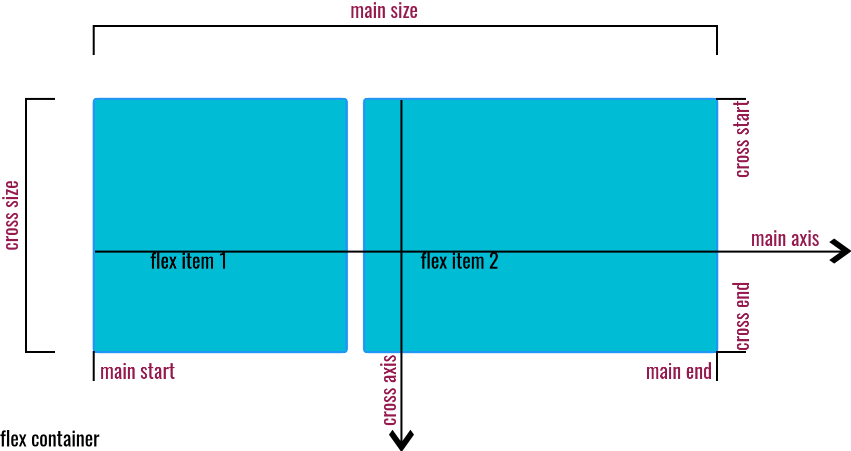
From the illustration above, there are two flex items and a flex container. There are also labels for other important aspects of Flexbox. These are the basic and important terms we'll use in the course of this tutorial.
Flex container:
This is an element having a display property of flex or inline-flex display: flex | inline-flex. From the illustration, it is the white backdrop holding the flex items.
Flex item:
These are direct children of the flex container. From the illustration, they are aligned from left to right. Note that flex items of a container can also become flex containers to elements within them.
Main axis:
This is the principal axis along which items are positioned. It is dependent on the flex-direction property ( it would become clearer in the next part of this series). Note that the main axis should not be confused with being horizontal.
Main start and end:
From the illustration, observe how the items are laid out from one point to the other on the main axis. The beginning is known as the main start while the other end is known as the main end.
Note that apart from direction dependency, writing mode should also be taken into account. For example, English is written from left to right, while Hebrew is written from right to left when flex-direction: row;
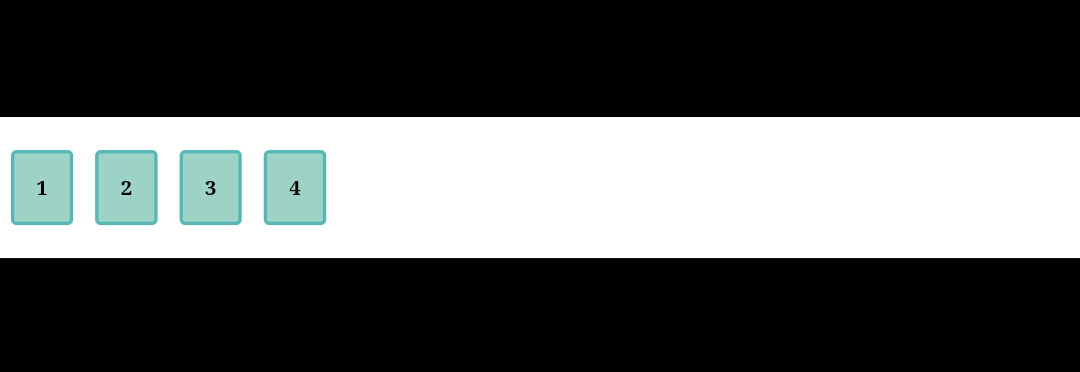
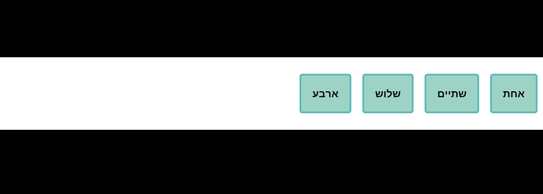
Therefore, the main start to main end runs from left to right for English, while the reverse is the case for Hebrew.
Main size:
This represents the size of the flex container or items along the main axis. It could either be width or height relative to the direction.
Cross axis:
This axis is always perpendicular to the main axis. It is also dependent on flex-direction.
Cross start and end:
From the cross axis, cross start is the beginning of the container or item, while cross end is the end. There aren't many languages that are written from bottom to top but Hanunó'o ( Indigenous to Filipinos) is one of a few. Therefore the cross start to cross end will be from bottom to top if flex-direction: row;
Cross size:
Like main size, it is the size of the element (flex container or items) along the cross axis. It could also be width or height depending on direction.
Wrapping up
If you made it to this point I bet you let out a "phew" 😁, it might seem hard to remember, but it'll become a lot clear when we utilize it in the next part. We've covered:
Flex container
Flex items
Main axis, main start and end, and main size
Cross axis, cross start and end, and cross size
Now that you know the basics, next, we'll get into the fun part😏, Flexbox properties, and how to use them.
If you found this helpful, like and comment 🙂, also if you have any additions feel free to put them in the comments.


